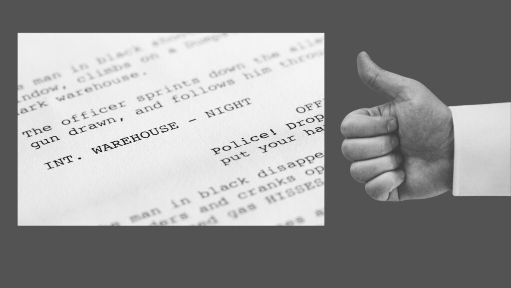
I read a lot of screenplays by new writers and one of the hardest things to explain to new screenwriters is that whitespace matters.
It’s understandable, though. Writers easily grasp that their action lines should never be more than five lines and can often be as short as one. They know they must use paragraphing from their early writing training in school. But the idea of “nothing” serving a purpose on a screenplay page takes a little getting used to.
I come from a print publication background, so the concept of whitespace –or what graphic designers refer to as “negative space”– isn’t at all foreign to me when discussing layouts, whether on screen or in print,
Yet even with my background in print, I was thoroughly surprised to learn that whitespace matters in a script. When I first started screenwriting and swapping scripts, notes that mentioned white space perplexed me. So much so that I went back to one reader to ask her to explain the note. Especially since I’d been so careful to keep my action lines within industry-standard.
She said it wasn’t that there were too many lines in my action blocks. But that there were too many action blocks without relief from the whitespace that dialogue offers.
Now, this isn’t always true. I’ve read many a fine opening or action sequence that has no dialogue.
Scripts need to look right
But regardless of my justification, I had to sit up and notice something I was unaware of previously: readers notice what a screenplay looks like. Yup. It’s true. I do it too, now I have a lot more experience. If I ever manage to get my hands on a hard copy of a script, I’m pretty sure I’ll start by thumbing through it like a flip cartoon to check that it looks right.
In fact, I do the digital equivalent immediately when I received a pdf from a writer I’ve not read before. Does it look right?
I’ve long been aware that the human eye and mind need visual punctuation while reading. Where it gets tricky, especially for new writers, is understanding that ‘less is more’ and they don’t need to merely add a bunch of hard returns into a dense page of pure black. They need to edit ruthlessly and trim down those flowery descriptions because dense blocks of text – known as “the black” – are uninviting. Just look at a long Facebook post that has no paragraphing. I’ll bet that most of the time you either scroll on by, or jump on with a troll-y gif or a TLDR.
Imagine how professional readers feel. When a script looks right, they get excited. When a script presents well, the chances of it turning into a good read increase dramatically. There’s a tiny possibility it could turn out to be a hidden gem.
It matters both ways
So what does a professionally written script look like in terms of whitespace?
Perhaps the easiest way to describe it is balanced. Your screenplay has three primary elements: Scene Headings, Action Blocks, and Dialogue. None should dominate. A page with too many scene headings needs rethinking. More common are pages of too many action lines or too much dialogue.
Yes, you can have too much dialogue. Pages and pages with only dialogue are called “I pages” because they look like the letter “I” which equals excessive whitespace.
The best scripts – and by that I mean the most accessible or reader-friendly – are those that achieve a balance between action and dialogue, with a clean format so that fast intercuts between locations are easy both to read and to visualize. Always remember that your audience is a reader.
Still not convinced that whitespace matters in your screenplay? Read this brilliantly written piece by Cameron Cubbison, That All-Important White Space.